In 2018 in the heart of Cairo, Egypt, Grain studio was taken from an idea on paper and launched our first collection of handmade sketchbooks.
Starting with 2 founders, a small room and a passion for making, the brand evolved into a community of Egyptian and South Sudanese creatives with a common love for books, craftsmanship, art and people.
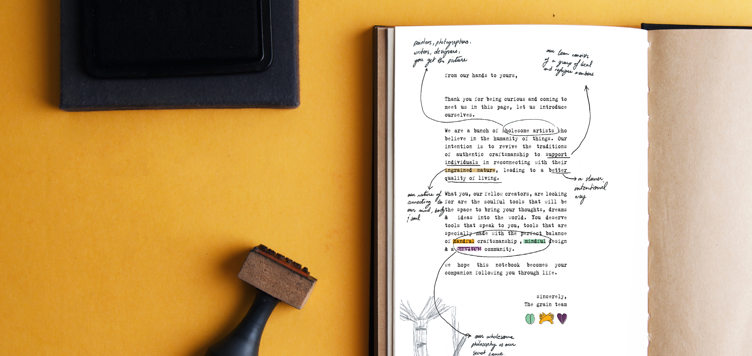
Creativity, humanity and connection are the core of the studio and the intention behind every piece and offering that comes out of the space.


To create grain’s logo, the story and values were the main focus. We knew we wanted the branding to be a very minimal element that
sets the stage for the community and what they make.
While the brand stayed with the logo alone for years, as the community grew and we had more to offer through our physical and online space, the values were revamped and given iconography to start tackling the different ways they showed up in our work.
The handful, mindful, and heartful trio of values were the pillars of every aspect of the brand, product and space.
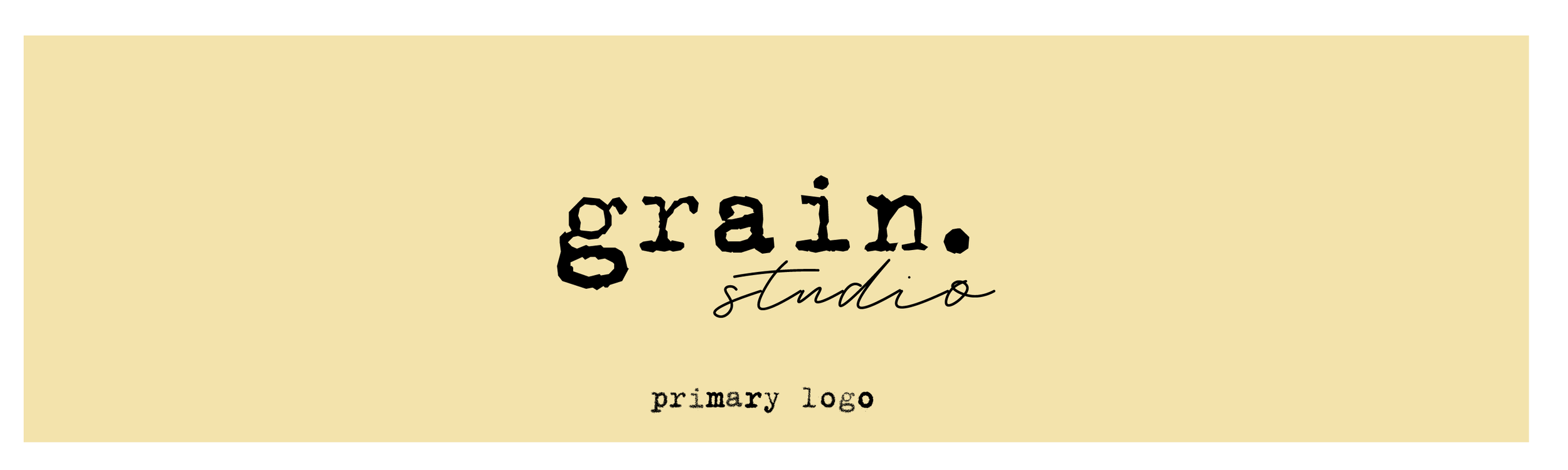
the primary logo, consisting of the full name of the studio is split into two typographic styles.
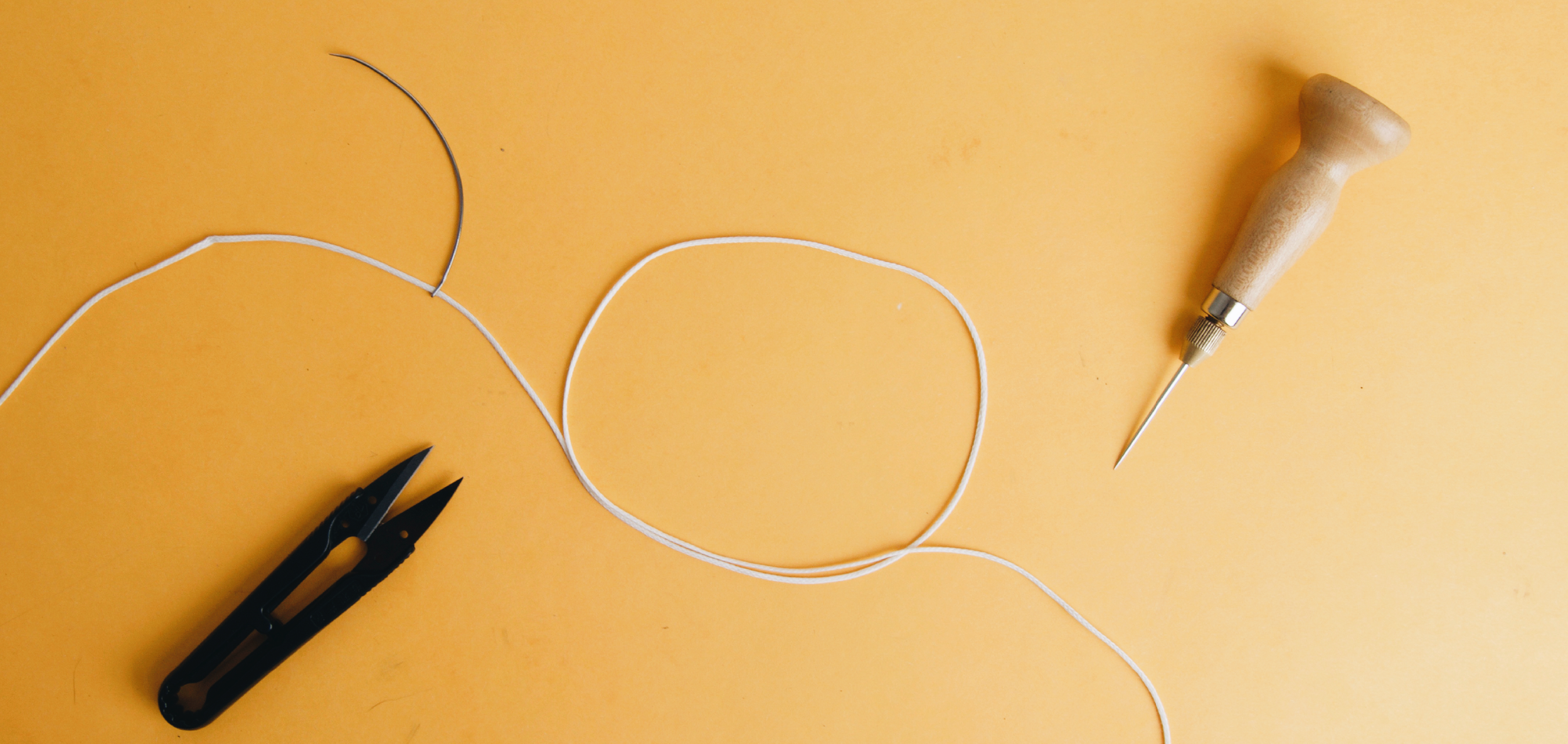
The typewriter gives an analog feel to to represent the combination of hand work beautifully paired with the tools used to craft the wholesome quality offerings. While the hand written font adds a more raw human element, like the notes or sketches taken before the final pieces are made and is meant to represent the “in the making” process.
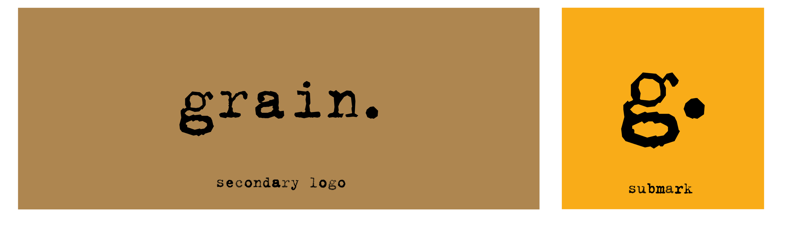

the secondary logo, with the main type only present, was added and is used to add a minimal element of branding to the products while also representing the products as the “grains” of the space. As well as the submark which comes in for smaller uses.

the brand icons were inspired by the 3 values that make up the studio and were used minimally to add a directional element to our offerings. Combining that with more earthy colors to create the tone of colors used.


Part of the offerings that grain gave the community was a high level of personalization for the companions we make.
Over time and with bigger orders, we decided to start having forms with all the different options for people to fill out. Letting us also do digitally prototyping to be able to give clients a quick way to see the different choices they had in mind.
These icons became a standard for our design process later on for all our companions and were part of our packaging especially when in retail spaces.

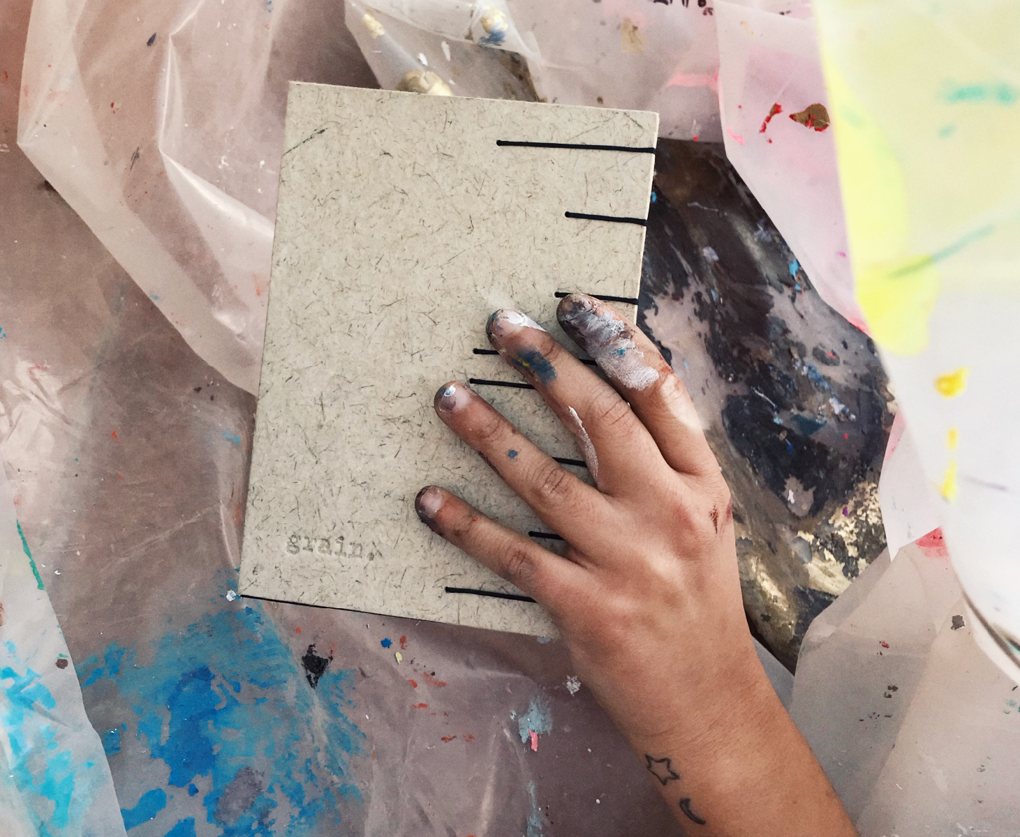
Mindfulness was the center of our approach when thinking of designing our packaging.
Our studio was all in house and had control over every little piece of paper that was leftover from the production of our product, we decided that taking those “scraps” to repurpose them and create either new products or our packaging out of it was one of the most intuitive and sustainable approaches.


As a result, our packaging always looked a little different between the different batches of companions that came out of our space.
Always based on sustainable types of paper (like kraft and recycled papers) with pops of color that came from our scrap paper sometimes.