

Three men of different backgrounds and characteristics coming together for the sake of forging one product relevant to all. That which binds us all, Color.
The word Hue is used to describe a more specific shade of a color and speaks to the different hues of personalities of the founders.
We aimed to creatively display the diverse backgrounds of our brand’s origins while also expressing the blending of characters and thoughts. Three parts making a whole.


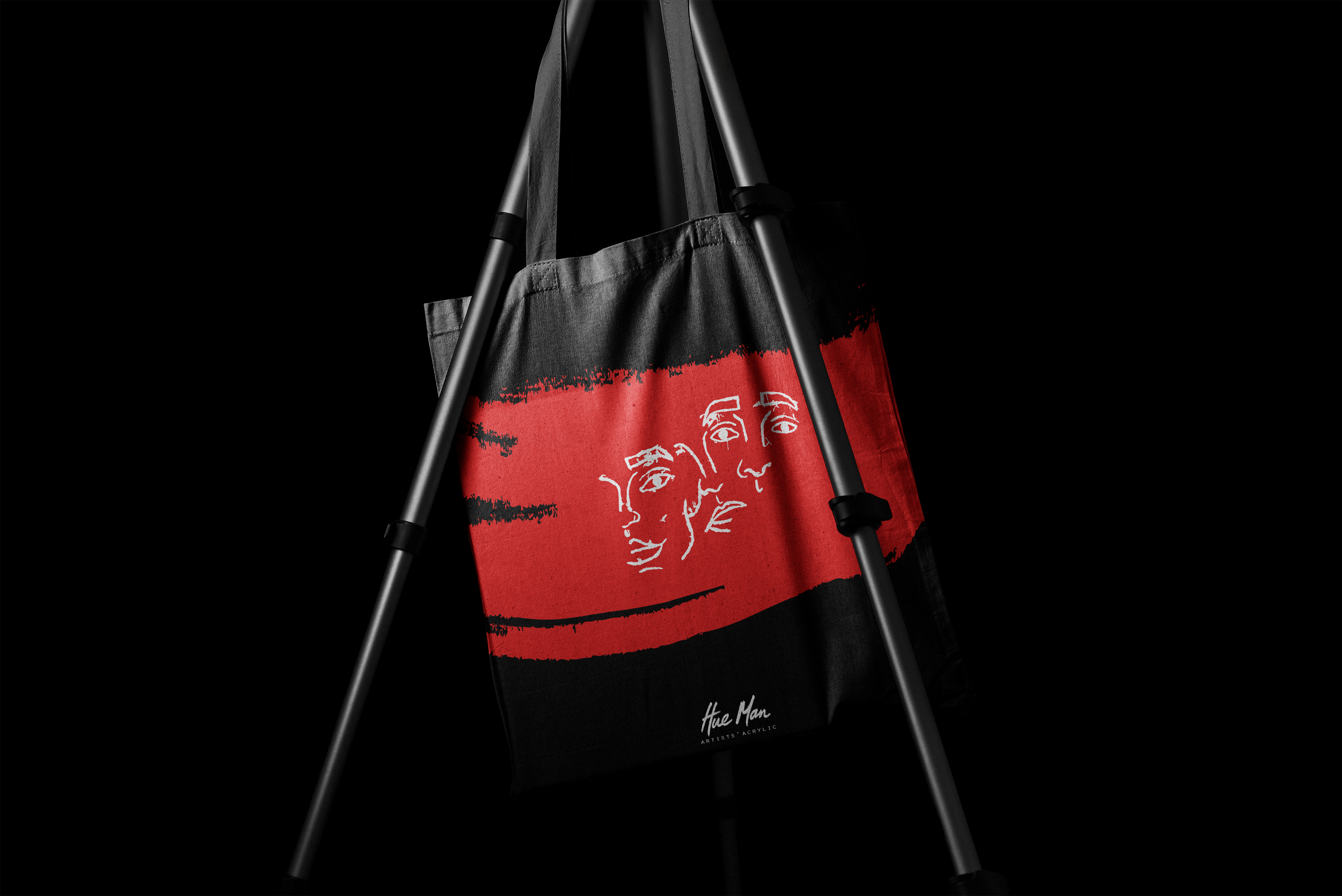
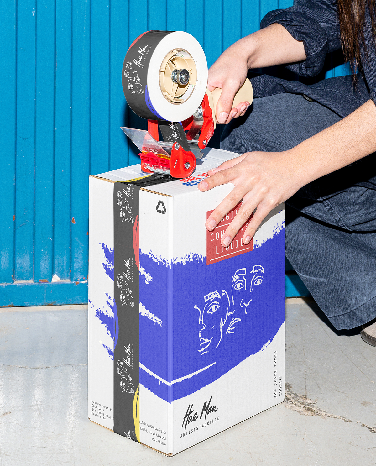
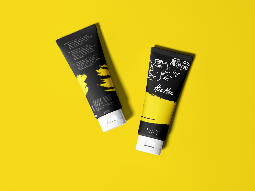
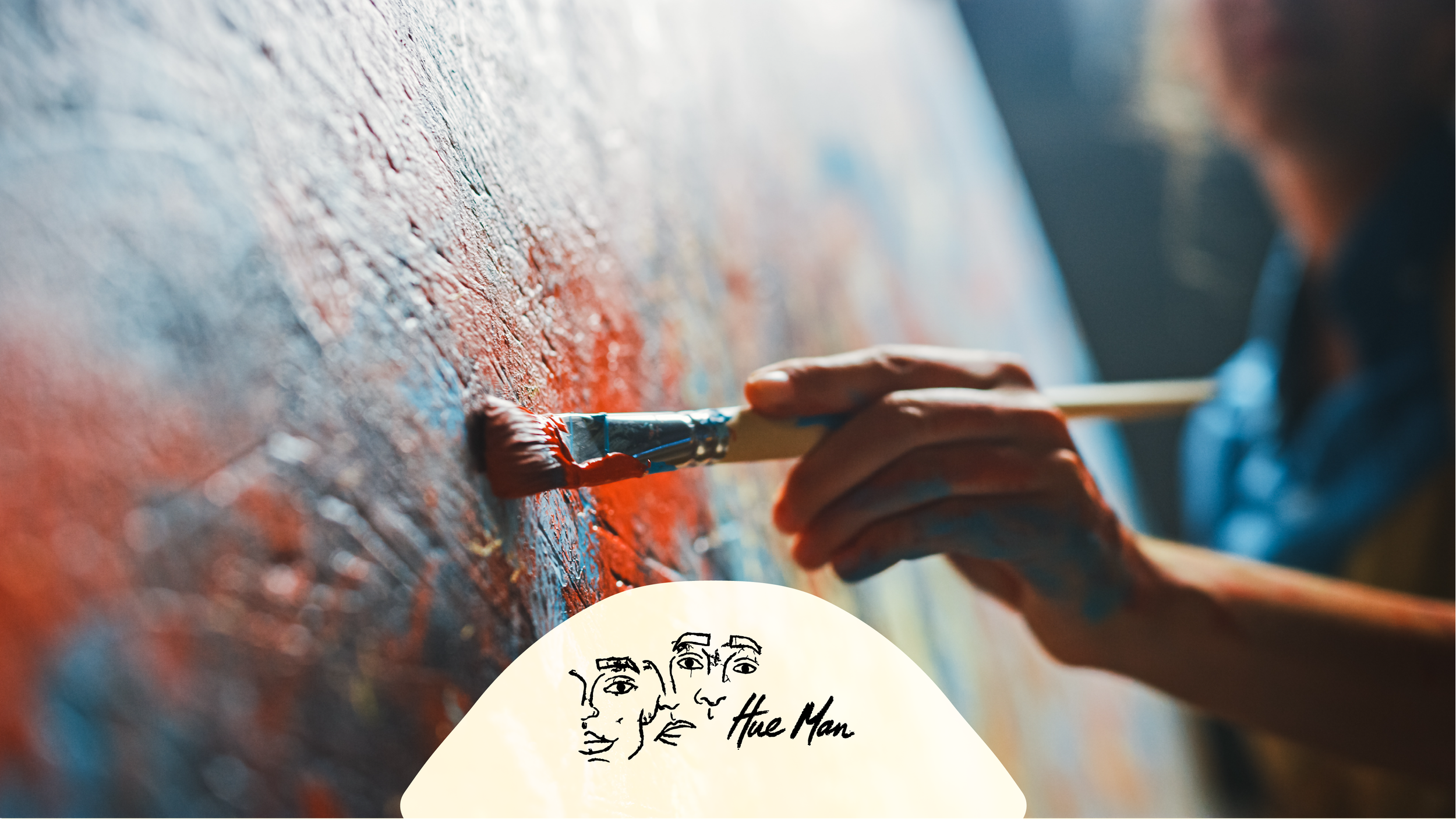
The final logo for the brand is an icon of three men drawn as if morphing into to one. The drawing style and typography were both done by hand to keep the human element and add an artistic touch.